Switch Between Small Multiples and Tile Maps in Tableau
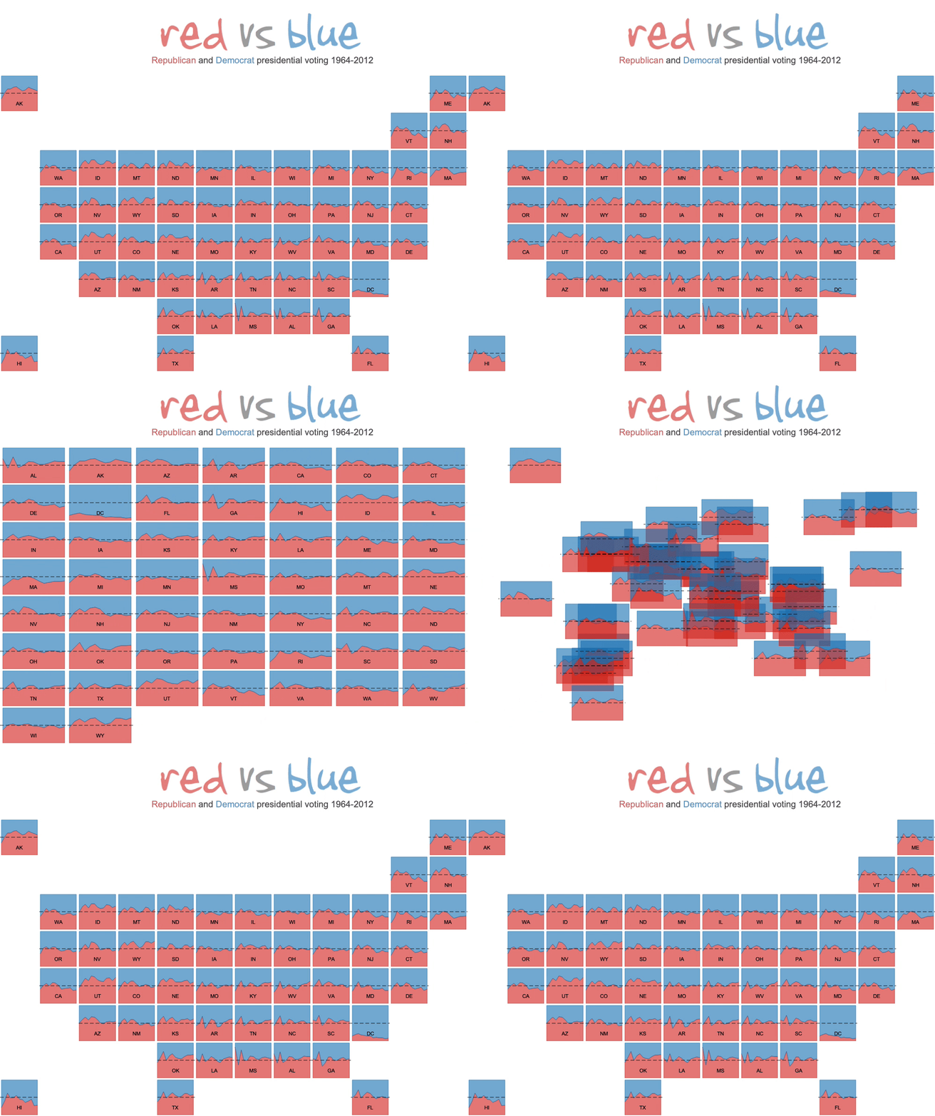


It's been a few years since I've posted a Tableau tutorial (I spent the last three years earning a Ph.D. in Information Design from Clemson University), but with the 2024 election looming, I wanted to showcase how to display both tile maps AND a sorted small multiple view. While tile maps look cool, they are often criticized for representing a pseudo-geography, so I thought it would be nice to allow the user to sort the tiles into alphabetical small multiples as well. This works particularly well with Tableau's default animations.

In a previous post, I showed you how to make a tile map, so you can check the tutorial there. This tutorial assumes you have already built a tile map. My tutorial is probably outdated as joins did not exist in Tableau back then, but you can at least use it to download the workbook.

To create the sorted small multiples, I used two calculations from Andy Kriebel's tutorial on small multiples.

As in Andy's tutorial, we need to create two calculations to sort the tiles:

Column Divider
(index()-1)%(round(sqrt(size())))

Row Divider
int( (index()-1)/(round(sqrt(size()))))

Next, create a parameter that allows the user to select how the tiles are displayed:


Then, we need to create two calculations to drive how the tiles are displayed (either as tile map or small multiples):
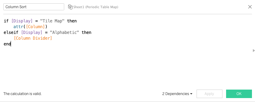
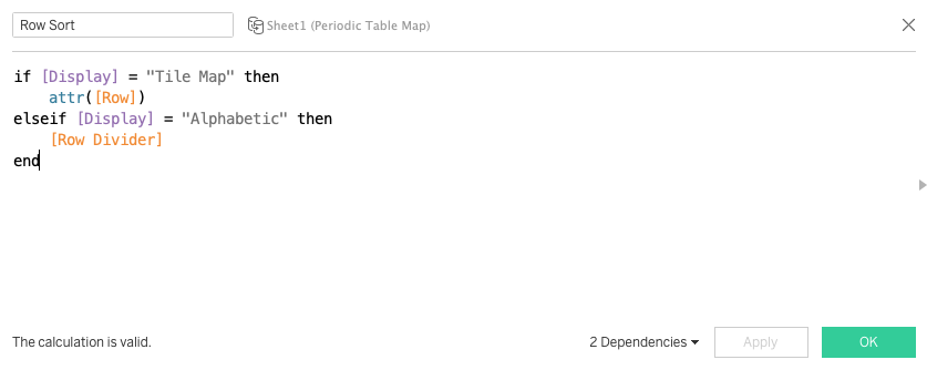


Add these calculations into the view with Column and Row corresponding to each calculation:


Make sure that both calculations are set to Compute Using the dimension you want to sort by. In this case, we are using the State:


Finally, make sure animations are on for the workbook. The animation works great on Tableau Public as well!

That's all there is to it! Feel free to download the workbook.

Path to the Playoff: Clemson and Alabama


I know a lot of college football fans are tired of seeing Clemson and Alabama in the playoffs.  This will be the fourth matchup between the Tigers and Crimson Tide in as many years.  These are the only two teams to make the College Football Playoff four years in a row!  As a Clemson alum/employee/fan, obviously I never get tired of seeing Clemson in the playoffs, so I wanted to create something to commemorate these amazing four years.

This visualization shows the College Football Playoff weekly rankings of each team for the last four years.  Hover over each week to see who each team played, the outcome, and how it affected their rankings:


You can also use the highlighter to select your team as well:


How To: Sheet Selector Using Set Actions in Tableau


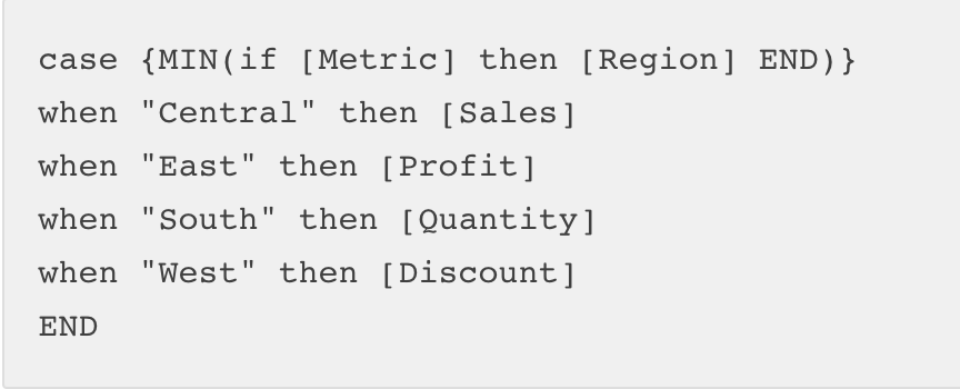
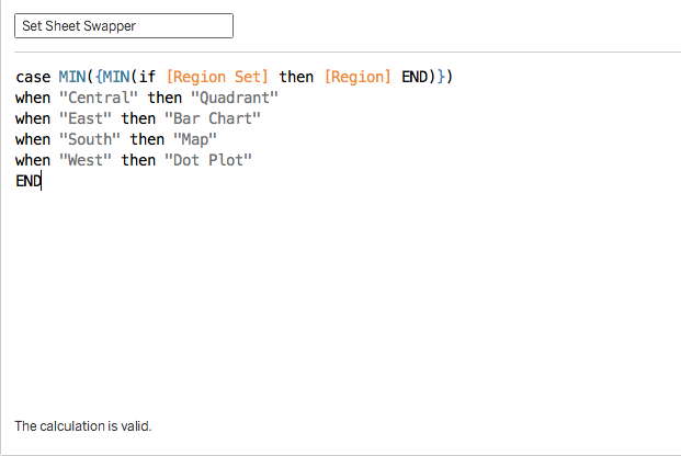
For some time now, I have been thinking about how to use Set Actions to create a sheet selector.  In previous tutorials, I walked you through how to create sheet selectors using a join and level of detail calculations.  Then, I saw a tutorial by Lindsey Poulter on how to dynamically switch metrics or dimensions, and I noticed a calculation that she had used:


I knew this could be adapted to filter sheets as well, so I started working through how to build out a sheet selector using Set Actions.  The idea for this is that we can build a dashboard and create user interactions that change the actual visualization rather than just dimensions or measures.  We could even use this to create our own story points if we wanted.

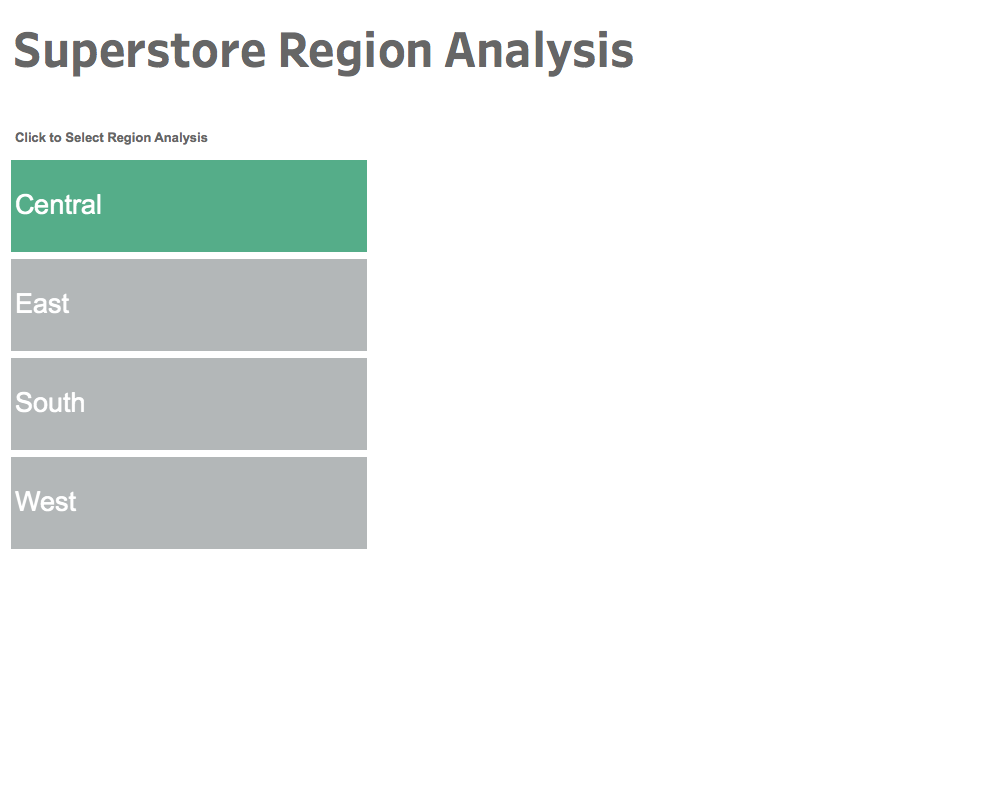
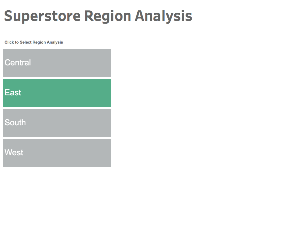
Let's take a look at how it's done.  In this example, I want to create a menu list of Regions, and I will be swapping the visual for a different analysis of each region.  The first thing we need to do is create our region list.

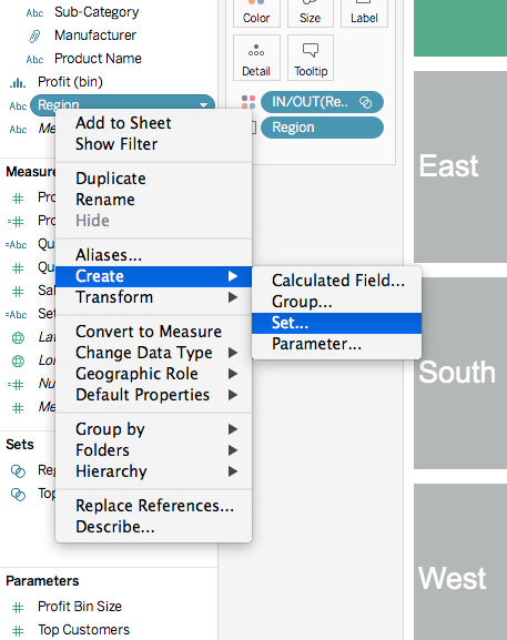
First, we will create a set on Region:


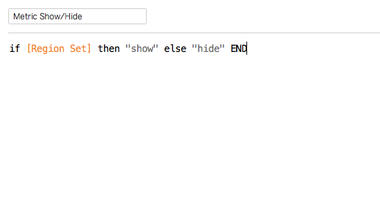
Then, we will create a calculation that Lindsey used so that multiple regions cannot be selected:


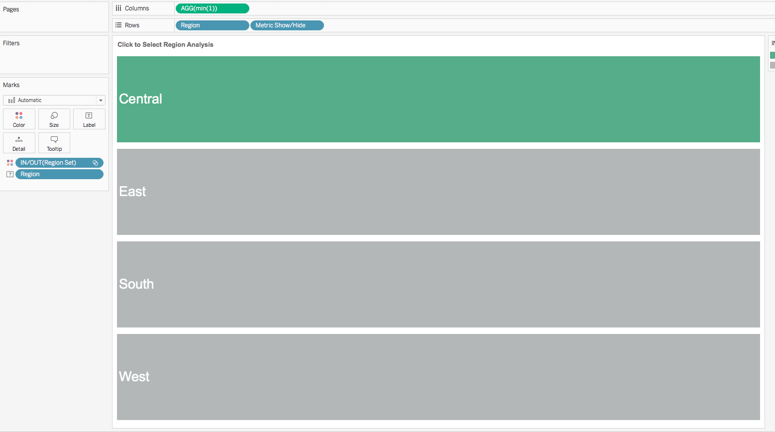
Now we can build our view like so:


Notice we have put the Region Set on Color.  This will allow the colors to change once the Set Action is created.

Now we can create the calculation that we adapted from Lindsey's tutorial to cause the sheets to filter.


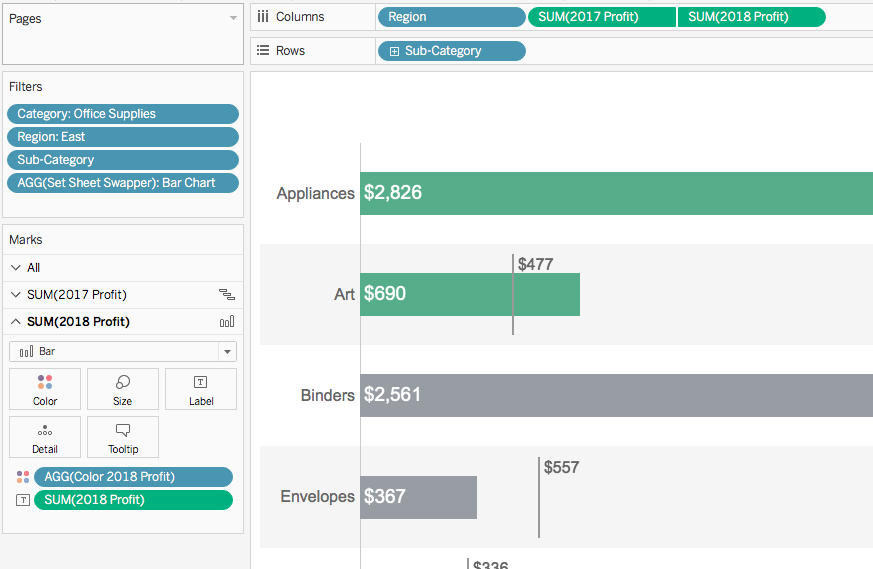
Essentially, we are going to check that the region has been clicked and then evaluate it to know which type of chart will be displayed.  In this case, I want a quadrant chart that I have created to display when I click Central, and a barbell chart when I click East, etc.  You can customize this however you want to match the charts you have created.

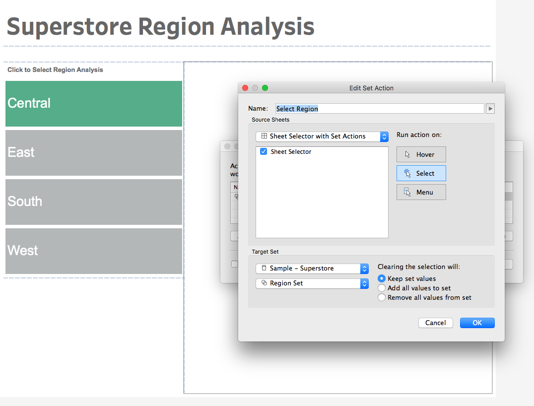
Now, we can begin to set up our dashboard and the Set Actions that will drive the sheet selector.  Create a dashboard and then create the following Set Action:


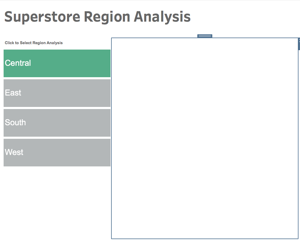
Now add a vertical container to the dashboard.  We are going to click on each region on our navigation, apply the filter for the sheet selector, and then drag the chart into the container.


Click Central on the nav, drag your central chart into the container, and hide the title.  In this case I have a quadrant chart.


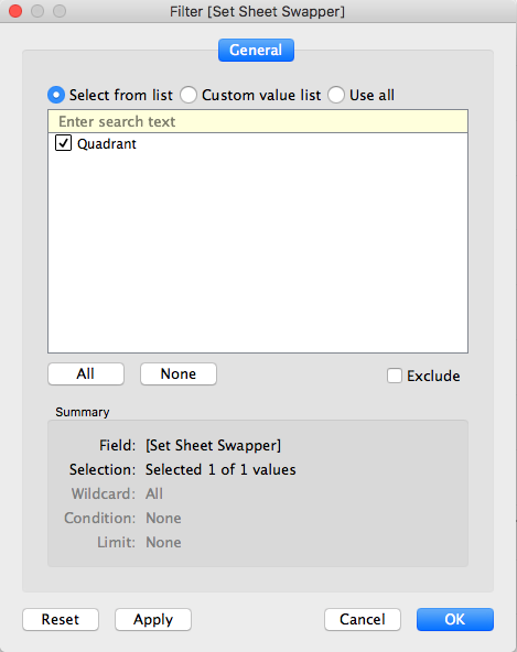
Now, go to the sheet for the central chart and apply the Set Sheet Swapper filter.  Since I have already clicked Central, the calculation will return Quadrant.  Click the quadrant check box and click apply.


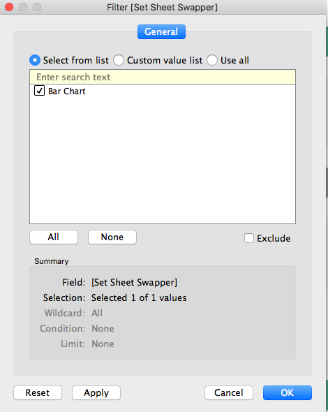
Now, go back to the dashboard, click East, drag the bar chart into the container, hide the title, and then apply the filter to the bar chart sheet.


Repeat the process for any remaining charts, and you will have a sheet selector driven by a Set Action!

Feel free to download the workbook and comment below with any questions.


How To: Row and Column Highlighter using Set Actions with Tableau


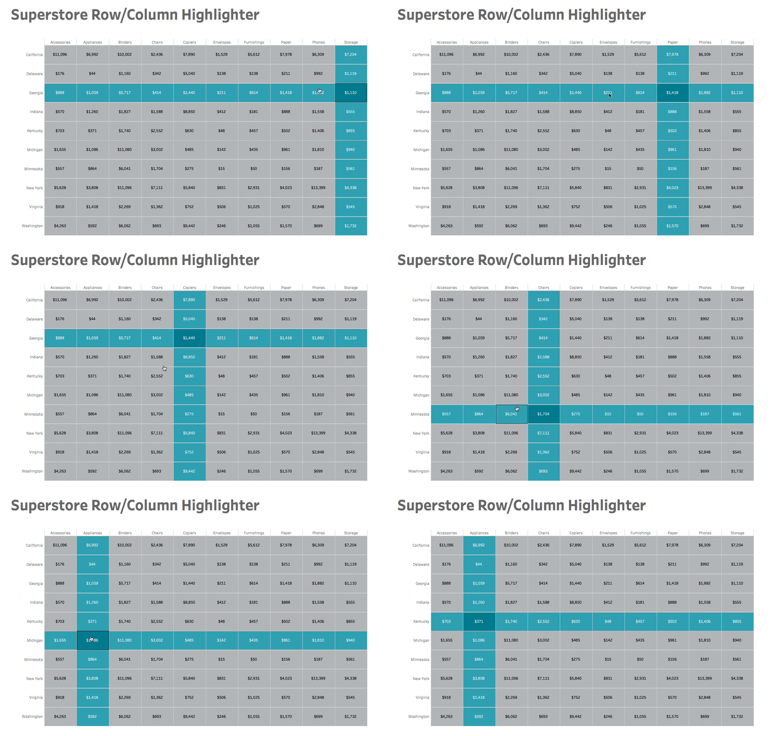
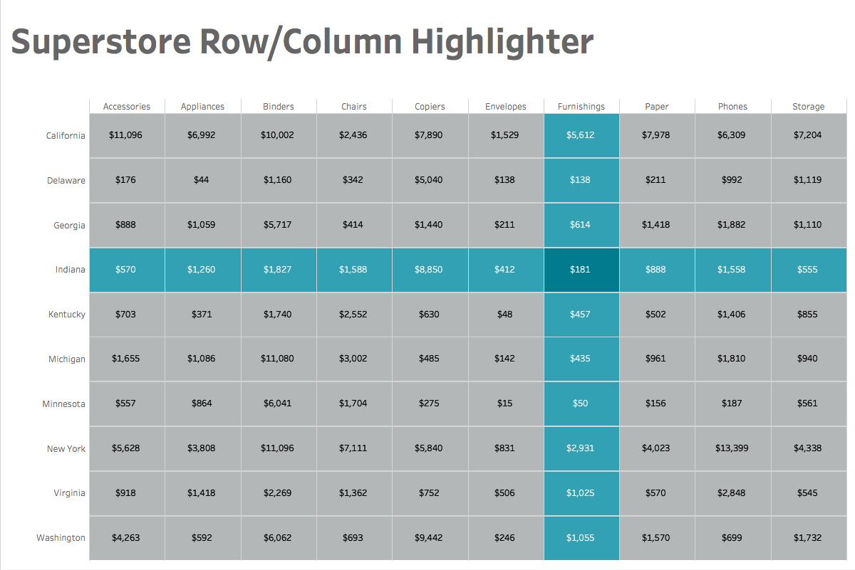
With set actions in Tableau 2018.3, we have the ability to create all sorts of new user interactions.  One thing that I thought would be helpful for users is to be able to see the rows and columns highlighted as well as designate which cell a user is specifically hovering on.  In this tutorial, I'll show you how to build a cross tab with row and column highlighting.

First, let's set up a basic cross tab view in Tableau:


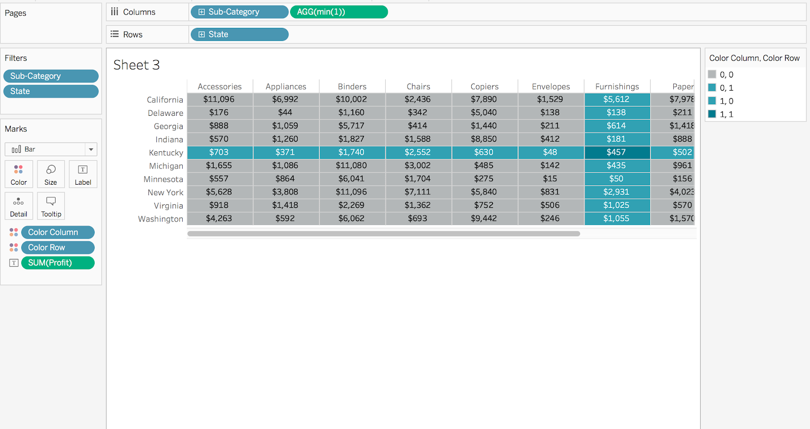
Next, we will add min(1) to our columns so that we can fill each cell using a bar chart that is sized to the maximum.


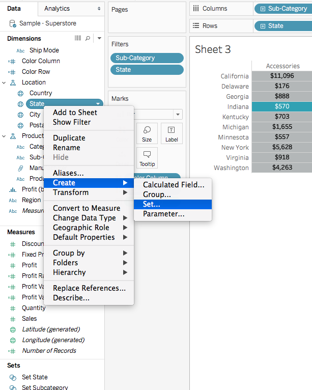
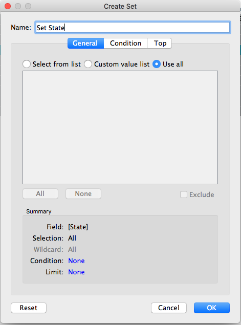
Since we want the highlight to occur on sub-category and state, we will need to create sets for both of these.


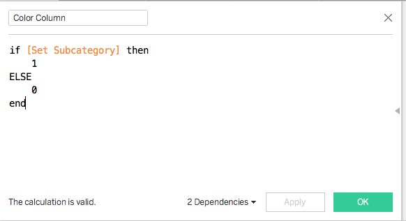
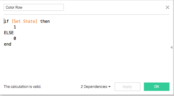
Now, we can create the calculations that will drive our highlighting.


Then we need to drag both calculations to the color shelf.  We can select both dimensions while holding shift and drag them to the shelf.


We can set up our coloring as desired.  Here we can see all of the outcomes of the hover.  0, 0 is for cells that aren't selected, 0,1 is for the row, 1,0 is for the column, and 1,1 is the intersection.  In this case, I want to color the cell that I am hovering over darker than the rows and columns.


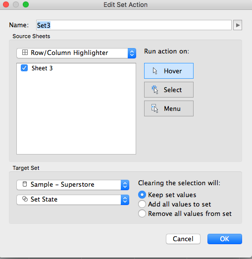
Now for the set action to power the highlight.  In this case we need two set actions since we have two sets that we need to account for.  Click Dashboard, Actions, and create two new Set Actions to change the Set State and Set Subcategory on Hover.


You will now have a cross tab with highlighting rows, columns, and selected cell!


Feel free to download the workbook and comment below with any questions.